


6 simple magazine tricks to make your online content more engaging
May 30, 2017
As dwindling print sales mean a shrinking media industry, so more and more journalists are eking out a living in marketing. We would not be the first to point out that content marketing is a natural fit for these journalists.
As well as soft skills like storytelling and an aptitude for collaboration, print journalists will bring a host of design-related knowledge. What might be described as ‘magazine UX’ traditionally came under the umbrella term: ‘magazine craft’.
One of the challenges of online content is making it look as awesome as a double-page spread in a magazine – not least because many web editors aren’t armed with the skills of making content ‘leap off the page’.
Just as with magazines, web editors want people to read on and keep clicking. This is why you never (ok, very very rarely) see a magazine page that just has a long, single block of copy filling the whole page.
The main principle is that people look at a page in different ways, at different times, so your page needs to reflect these habits. People like to scan a whole page before they dive in. Giving people lots of different opportunities to join the flow is important too – paragraph headers, pull quotes etc. People like to have a sense of the whole before they get started. They also like to navigate to the section they’re most interested in.
Here are six magazine tricks that web editors can employ to make their articles more engaging, draw the eye down the page and increase shares and comments.
1. Pictures
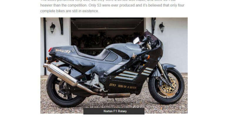
An interesting, unique and useful picture is of course best. It is also important to place it at the right moment: you can set up intrigue about what it refers to encourage reading, or you can introduce an idea and illustrate it with your picture.
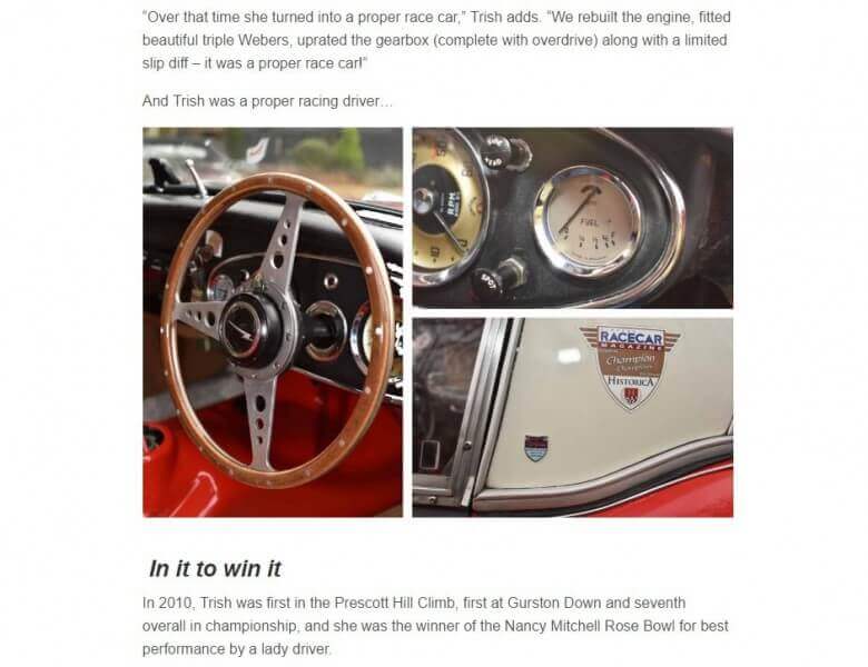
If you have lots of pictures and/or your pictures aren’t landscape, you can always create little triptychs. You can also build narrative into these, or work with pictures that, by themselves, don’t look great, but as a collage, have an impact.
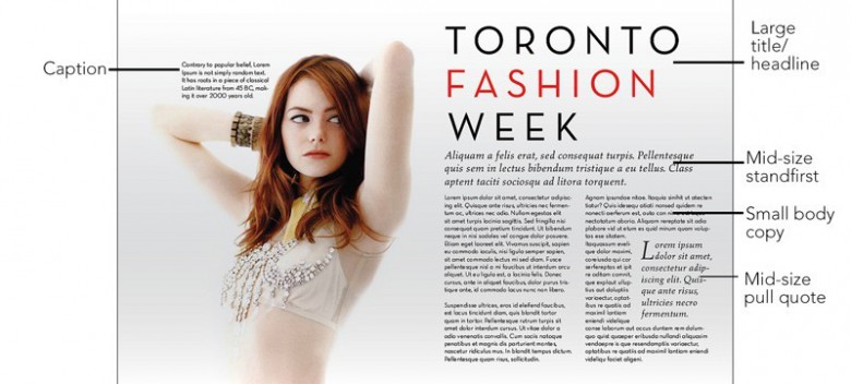
Eye contact from the page is engaging and humans respond to being looked at, so you might choose a picture of a person looking at the camera.

If your article is about something quite abstract, photography may not work. Vectors, illustrations and diagrams work well and there are lots of free sites like Pixabay to get them from. Vectors can also be good for topical signposting – to let people know what each section of your article is about.

2. Captions
The caption is an underrated asset. What you say about the picture can encourage reading, offer value, be funny or set up intrigue: the promise of a question answered.
3. Hierarchy
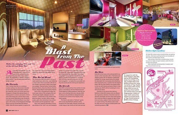
Magazines create a hierarchy with copy and images. They usually present a single headline and a single large picture, a standfirst or intro followed, by lots of flowing copy and smaller pictures.
For longer articles, help guide people through by signposting topic changes with paragraph headers and corresponding H tags.
- H1 tags for major topic changes
- H2 sections broken down within H1 tags
- H3 sections broken down within H2 tags
Add bold titles in for impact. You could also try bringing out key statements in the body copy in bold.
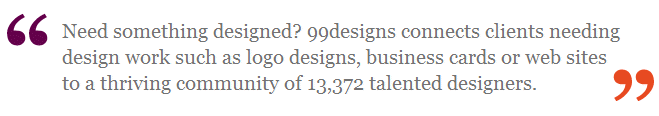
4. Pull quotes
Pull quotes seem to be an underused asset online. Draw out the most valuable or intriguing or bold or contentious sentence in your copy to encourage people scanning to dive in. And don’t feel obligated to run the quote as it is in the copy – edit it how you want as long as you don’t change the sense, the meaning.
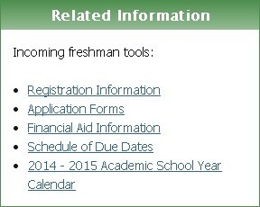
5. Info boxes
An info box promises value as well as the suggestion of speed, brevity. Anything in a list of more than three can be pulled out of the body copy and put as bullet points in an info box.
You might also choose to remove anything tangential in the copy and include it as an info box.
6. Bullet point lists
Lists within the copy can be used to break up large wedges of copy, they also aid general readability – letting the reader know that what they are reading is a number of things under a single type/heading.
Employ these simple, quick and cheap devices and you’ll see how much of a difference it makes – not just to your eye, but to your page traffic.
Click here for advice on how to create your content strategy.
Gravity Global – Performance Marketing offers a range of digital marketing services, including content marketing. Get in touch using the following form to find out how we can help your business grow. Or email hello@www.gravityglobal.com.
Share
Subscribe

